Category Archives: General

Opportunities for AI in Accessibility

In reading Joe Dolson’s recent piece on the intersection of AI and accessibility, I absolutely appreciated the skepticism that he has for AI in general as well as for the ways that many have been using it. In fact, I’m very skeptical of AI myself, despite my role at Microsoft as an accessibility innovation strategist who helps run the AI for Accessibility grant program. As with any tool, AI can be used in very constructive, inclusive, and accessible ways; and it can also be used in destructive, exclusive, and harmful ones. And there are a ton of uses somewhere in the mediocre middle as well.

I’d like you to consider this a “yes… and” piece to complement Joe’s post. I’m not trying to refute any of what he’s saying but rather provide some visibility to projects and opportunities where AI can make meaningful differences for people with disabilities. To be clear, I’m not saying that there aren’t real risks or pressing issues with AI that need to be addressed—there are, and we’ve needed to address them, like, yesterday—but I want to take a little time to talk about what’s possible in hopes that we’ll get there one day.

Alternative text

Joe’s piece spends a lot of time talking about computer-vision models generating alternative text. He highlights a ton of valid issues with the current state of things. And while computer-vision models continue to improve in the quality and richness of detail in their descriptions, their results aren’t great. As he rightly points out, the current state of image analysis is pretty poor—especially for certain image types—in large part because current AI systems examine images in isolation rather than within the contexts that they’re in (which is a consequence of having separate “foundation” models for text analysis and image analysis). Today’s models aren’t trained to distinguish between images that are contextually relevant (that should probably have descriptions) and those that are purely decorative (which might not need a description) either. Still, I still think there’s potential in this space.

As Joe mentions, human-in-the-loop authoring of alt text should absolutely be a thing. And if AI can pop in to offer a starting point for alt text—even if that starting point might be a prompt saying What is this BS? That’s not right at all… Let me try to offer a starting point—I think that’s a win.

Taking things a step further, if we can specifically train a model to analyze image usage in context, it could help us more quickly identify which images are likely to be decorative and which ones likely require a description. That will help reinforce which contexts call for image descriptions and it’ll improve authors’ efficiency toward making their pages more accessible.

While complex images—like graphs and charts—are challenging to describe in any sort of succinct way (even for humans), the image example shared in the GPT4 announcement points to an interesting opportunity as well. Let’s suppose that you came across a chart whose description was simply the title of the chart and the kind of visualization it was, such as: Pie chart comparing smartphone usage to feature phone usage among US households making under $30,000 a year. (That would be a pretty awful alt text for a chart since that would tend to leave many questions about the data unanswered, but then again, let’s suppose that that was the description that was in place.) If your browser knew that that image was a pie chart (because an onboard model concluded this), imagine a world where users could ask questions like these about the graphic:


Do more people use smartphones or feature phones?


How many more?


Is there a group of people that don’t fall into either of these buckets?


How many is that?

Setting aside the realities of large language model (LLM) hallucinations—where a model just makes up plausible-sounding “facts”—for a moment, the opportunity to learn more about images and data in this way could be revolutionary for blind and low-vision folks as well as for people with various forms of color blindness, cognitive disabilities, and so on. It could also be useful in educational contexts to help people who can see these charts, as is, to understand the data in the charts.

Taking things a step further: What if you could ask your browser to simplify a complex chart? What if you could ask it to isolate a single line on a line graph? What if you could ask your browser to transpose the colors of the different lines to work better for form of color blindness you have? What if you could ask it to swap colors for patterns? Given these tools’ chat-based interfaces and our existing ability to manipulate images in today’s AI tools, that seems like a possibility.

Now imagine a purpose-built model that could extract the information from that chart and convert it to another format. For example, perhaps it could turn that pie chart (or better yet, a series of pie charts) into more accessible (and useful) formats, like spreadsheets. That would be amazing!

Matching algorithms

Safiya Umoja Noble absolutely hit the nail on the head when she titled her book Algorithms of Oppression. While her book was focused on the ways that search engines reinforce racism, I think that it’s equally true that all computer models have the potential to amplify conflict, bias, and intolerance. Whether it’s Twitter always showing you the latest tweet from a bored billionaire, YouTube sending us into a Q-hole, or Instagram warping our ideas of what natural bodies look like, we know that poorly authored and maintained algorithms are incredibly harmful. A lot of this stems from a lack of diversity among the people who shape and build them. When these platforms are built with inclusively baked in, however, there’s real potential for algorithm development to help people with disabilities.

Take Mentra, for example. They are an employment network for neurodivergent people. They use an algorithm to match job seekers with potential employers based on over 75 data points. On the job-seeker side of things, it considers each candidate’s strengths, their necessary and preferred workplace accommodations, environmental sensitivities, and so on. On the employer side, it considers each work environment, communication factors related to each job, and the like. As a company run by neurodivergent folks, Mentra made the decision to flip the script when it came to typical employment sites. They use their algorithm to propose available candidates to companies, who can then connect with job seekers that they are interested in; reducing the emotional and physical labor on the job-seeker side of things.

When more people with disabilities are involved in the creation of algorithms, that can reduce the chances that these algorithms will inflict harm on their communities. That’s why diverse teams are so important.

Imagine that a social media company’s recommendation engine was tuned to analyze who you’re following and if it was tuned to prioritize follow recommendations for people who talked about similar things but who were different in some key ways from your existing sphere of influence. For example, if you were to follow a bunch of nondisabled white male academics who talk about AI, it could suggest that you follow academics who are disabled or aren’t white or aren’t male who also talk about AI. If you took its recommendations, perhaps you’d get a more holistic and nuanced understanding of what’s happening in the AI field. These same systems should also use their understanding of biases about particular communities—including, for instance, the disability community—to make sure that they aren’t recommending any of their users follow accounts that perpetuate biases against (or, worse, spewing hate toward) those groups.

Other ways that AI can helps people with disabilities

If I weren’t trying to put this together between other tasks, I’m sure that I could go on and on, providing all kinds of examples of how AI could be used to help people with disabilities, but I’m going to make this last section into a bit of a lightning round. In no particular order:


Voice preservation. You may have seen the VALL-E paper or Apple’s Global Accessibility Awareness Day announcement or you may be familiar with the voice-preservation offerings from Microsoft, Acapela, or others. It’s possible to train an AI model to replicate your voice, which can be a tremendous boon for people who have ALS (Lou Gehrig’s disease) or motor-neuron disease or other medical conditions that can lead to an inability to talk. This is, of course, the same tech that can also be used to create audio deepfakes, so it’s something that we need to approach responsibly, but the tech has truly transformative potential.


Voice recognition. Researchers like those in the Speech Accessibility Project are paying people with disabilities for their help in collecting recordings of people with atypical speech. As I type, they are actively recruiting people with Parkinson’s and related conditions, and they have plans to expand this to other conditions as the project progresses. This research will result in more inclusive data sets that will let more people with disabilities use voice assistants, dictation software, and voice-response services as well as control their computers and other devices more easily, using only their voice.


Text transformation. The current generation of LLMs is quite capable of adjusting existing text content without injecting hallucinations. This is hugely empowering for people with cognitive disabilities who may benefit from text summaries or simplified versions of text or even text that’s prepped for Bionic Reading.

The importance of diverse teams and data

We need to recognize that our differences matter. Our lived experiences are influenced by the intersections of the identities that we exist in. These lived experiences—with all their complexities (and joys and pain)—are valuable inputs to the software, services, and societies that we shape. Our differences need to be represented in the data that we use to train new models, and the folks who contribute that valuable information need to be compensated for sharing it with us. Inclusive data sets yield more robust models that foster more equitable outcomes.

Want a model that doesn’t demean or patronize or objectify people with disabilities? Make sure that you have content about disabilities that’s authored by people with a range of disabilities, and make sure that that’s well represented in the training data.

Want a model that doesn’t use ableist language? You may be able to use existing data sets to build a filter that can intercept and remediate ableist language before it reaches readers. That being said, when it comes to sensitivity reading, AI models won’t be replacing human copy editors anytime soon. 

Want a coding copilot that gives you accessible recommendations from the jump? Train it on code that you know to be accessible.

I have no doubt that AI can and will harm people… today, tomorrow, and well into the future. But I also believe that we can acknowledge that and, with an eye towards accessibility (and, more broadly, inclusion), make thoughtful, considerate, and intentional changes in our approaches to AI that will reduce harm over time as well. Today, tomorrow, and well into the future.

Many thanks to Kartik Sawhney for helping me with the development of this piece, Ashley Bischoff for her invaluable editorial assistance, and, of course, Joe Dolson for the prompt.

I am a creative.

I am a creative. What I do is alchemy. It is a mystery. I do not so much do it, as let it be done through me.

I am a creative. Not all creative people like this label. Not all see themselves this way. Some creative people see science in what they do. That is their truth, and I respect it. Maybe I even envy them, a little. But my process is different—my being is different.

Apologizing and qualifying in advance is a distraction. That’s what my brain does to sabotage me. I set it aside for now. I can come back later to apologize and qualify. After I’ve said what I came to say. Which is hard enough. 

Except when it is easy and flows like a river of wine.

Sometimes it does come that way. Sometimes what I need to create comes in an instant. I have learned not to say it at that moment, because if you admit that sometimes the idea just comes and it is the best idea and you know it is the best idea, they think you don’t work hard enough.

Sometimes I work and work and work until the idea comes. Sometimes it comes instantly and I don’t tell anyone for three days. Sometimes I’m so excited by the idea that came instantly that I blurt it out, can’t help myself. Like a boy who found a prize in his Cracker Jacks. Sometimes I get away with this. Sometimes other people agree: yes, that is the best idea. Most times they don’t and I regret having  given way to enthusiasm. 

Enthusiasm is best saved for the meeting where it will make a difference. Not the casual get-together that precedes that meeting by two other meetings. Nobody knows why we have all these meetings. We keep saying we’re doing away with them, but then just finding other ways to have them. Sometimes they are even good. But other times they are a distraction from the actual work. The proportion between when meetings are useful, and when they are a pitiful distraction, varies, depending on what you do and where you do it. And who you are and how you do it. Again I digress. I am a creative. That is the theme.

Sometimes many hours of hard and patient work produce something that is barely serviceable. Sometimes I have to accept that and move on to the next project.

Don’t ask about process. I am a creative.

I am a creative. I don’t control my dreams. And I don’t control my best ideas.

I can hammer away, surround myself with facts or images, and sometimes that works. I can go for a walk, and sometimes that works. I can be making dinner and there’s a Eureka having nothing to do with sizzling oil and bubbling pots. Often I know what to do the instant I wake up. And then, almost as often, as I become conscious and part of the world again, the idea that would have saved me turns to vanishing dust in a mindless wind of oblivion. For creativity, I believe, comes from that other world. The one we enter in dreams, and perhaps, before birth and after death. But that’s for poets to wonder, and I am not a poet. I am a creative. And it’s for theologians to mass armies about in their creative world that they insist is real. But that is another digression. And a depressing one. Maybe on a much more important topic than whether I am a creative or not. But still a digression from what I came here to say.

Sometimes the process is avoidance. And agony. You know the cliché about the tortured artist? It’s true, even when the artist (and let’s put that noun in quotes) is trying to write a soft drink jingle, a callback in a tired sitcom, a budget request.

Some people who hate being called creative may be closeted creatives, but that’s between them and their gods. No offense meant. Your truth is true, too. But mine is for me. 

Creatives recognize creatives.

Creatives recognize creatives like queers recognize queers, like real rappers recognize real rappers, like cons know cons. Creatives feel massive respect for creatives. We love, honor, emulate, and practically deify the great ones. To deify any human is, of course, a tragic mistake. We have been warned. We know better. We know people are just people. They squabble, they are lonely, they regret their most important decisions, they are poor and hungry, they can be cruel, they can be just as stupid as we can, because, like us, they are clay. But. But. But they make this amazing thing. They birth something that did not exist before them, and could not exist without them. They are the mothers of ideas. And I suppose, since it’s just lying there, I have to add that they are the mothers of invention. Ba dum bum! OK, that’s done. Continue.

Creatives belittle our own small achievements, because we compare them to those of the great ones. Beautiful animation! Well, I’m no Miyazaki. Now THAT is greatness. That is greatness straight from the mind of God. This half-starved little thing that I made? It more or less fell off the back of the turnip truck. And the turnips weren’t even fresh.

Creatives knows that, at best, they are Salieri. Even the creatives who are Mozart believe that. 

I am a creative. I haven’t worked in advertising in 30 years, but in my nightmares, it’s my former creative directors who judge me. And they are right to do so. I am too lazy, too facile, and when it really counts, my mind goes blank. There is no pill for creative dysfunction.

I am a creative. Every deadline I make is an adventure that makes Indiana Jones look like a pensioner snoring in a deck chair. The longer I remain a creative, the faster I am when I do my work and the longer I brood and walk in circles and stare blankly before I do that work. 

I am still 10 times faster than people who are not creative, or people who have only been creative a short while, or people who have only been professionally creative a short while. It’s just that, before I work 10 times as fast as they do, I spend twice as long as they do putting the work off. I am that confident in my ability to do a great job when I put my mind to it. I am that addicted to the adrenaline rush of postponement. I am still that afraid of the jump.

I am not an artist.

I am a creative. Not an artist. Though I dreamed, as a lad, of someday being that. Some of us belittle our gifts and dislike ourselves because we are not Michelangelos and Warhols. That is narcissism—but at least we aren’t in politics.

I am a creative. Though I believe in reason and science, I decide by intuition and impulse. And live with what follows—the catastrophes as well as the triumphs. 

I am a creative. Every word I’ve said here will annoy other creatives, who see things differently. Ask two creatives a question, get three opinions. Our disagreement, our passion about it, and our commitment to our own truth are, at least to me, the proofs that we are creatives, no matter how we may feel about it.

I am a creative. I lament my lack of taste in the areas about which I know very little, which is to say almost all areas of human knowledge. And I trust my taste above all other things in the areas closest to my heart, or perhaps, more accurately, to my obsessions. Without my obsessions, I would probably have to spend my time looking life in the eye, and almost none of us can do that for long. Not honestly. Not really. Because much in life, if you really look at it, is unbearable.

I am a creative. I believe, as a parent believes, that when I am gone, some small good part of me will carry on in the mind of at least one other person.

Working saves me from worrying about work.

I am a creative. I live in dread of my small gift suddenly going away.

I am a creative. I am too busy making the next thing to spend too much time deeply considering that almost nothing I make will come anywhere near the greatness I comically aspire to.

I am a creative. I believe in the ultimate mystery of process. I believe in it so much, I am even fool enough to publish an essay I dictated into a tiny machine and didn’t take time to review or revise. I won’t do this often, I promise. But I did it just now, because, as afraid as I might be of your seeing through my pitiful gestures toward the beautiful, I was even more afraid of forgetting what I came to say. 

There. I think I’ve said it. 

Humility: An Essential Value

Humility, a designer’s essential value—that has a nice ring to it. What about humility, an office manager’s essential value? Or a dentist’s? Or a librarian’s? They all sound great. When humility is our guiding light, the path is always open for fulfillment, evolution, connection, and engagement. In this chapter, we’re going to talk about why.

That said, this is a book for designers, and to that end, I’d like to start with a story—well, a journey, really. It’s a personal one, and I’m going to make myself a bit vulnerable along the way. I call it:

The Tale of Justin’s Preposterous Pate

When I was coming out of art school, a long-haired, goateed neophyte, print was a known quantity to me; design on the web, however, was rife with complexities to navigate and discover, a problem to be solved. Though I had been formally trained in graphic design, typography, and layout, what fascinated me was how these traditional skills might be applied to a fledgling digital landscape. This theme would ultimately shape the rest of my career.

So rather than graduate and go into print like many of my friends, I devoured HTML and JavaScript books into the wee hours of the morning and taught myself how to code during my senior year. I wanted—nay, needed—to better understand the underlying implications of what my design decisions would mean once rendered in a browser.

The late ’90s and early 2000s were the so-called “Wild West” of web design. Designers at the time were all figuring out how to apply design and visual communication to the digital landscape. What were the rules? How could we break them and still engage, entertain, and convey information? At a more macro level, how could my values, inclusive of humility, respect, and connection, align in tandem with that? I was hungry to find out.

Though I’m talking about a different era, those are timeless considerations between non-career interactions and the world of design. What are your core passions, or values, that transcend medium? It’s essentially the same concept we discussed earlier on the direct parallels between what fulfills you, agnostic of the tangible or digital realms; the core themes are all the same.

First within tables, animated GIFs, Flash, then with Web Standards, divs, and CSS, there was personality, raw unbridled creativity, and unique means of presentment that often defied any semblance of a visible grid. Splash screens and “browser requirement” pages aplenty. Usability and accessibility were typically victims of such a creation, but such paramount facets of any digital design were largely (and, in hindsight, unfairly) disregarded at the expense of experimentation.

For example, this iteration of my personal portfolio site (“the pseudoroom”) from that era was experimental, if not a bit heavy- handed, in the visual communication of the concept of a living sketchbook. Very skeuomorphic. I collaborated with fellow designer and dear friend Marc Clancy (now a co-founder of the creative project organizing app Milanote) on this one, where we’d first sketch and then pass a Photoshop file back and forth to trick things out and play with varied user interactions. Then, I’d break it down and code it into a digital layout.

Along with design folio pieces, the site also offered free downloads for Mac OS customizations: desktop wallpapers that were effectively design experimentation, custom-designed typefaces, and desktop icons.

From around the same time, GUI Galaxy was a design, pixel art, and Mac-centric news portal some graphic designer friends and I conceived, designed, developed, and deployed.

Design news portals were incredibly popular during this period, featuring (what would now be considered) Tweet-size, small-format snippets of pertinent news from the categories I previously mentioned. If you took Twitter, curated it to a few categories, and wrapped it in a custom-branded experience, you’d have a design news portal from the late 90s / early 2000s.

We as designers had evolved and created a bandwidth-sensitive, web standards award-winning, much more accessibility-conscious website. Still ripe with experimentation, yet more mindful of equitable engagement. You can see a couple of content panes here, noting general news (tech, design) and Mac-centric news below. We also offered many of the custom downloads I cited before as present on my folio site but branded and themed to GUI Galaxy.

The site’s backbone was a homegrown CMS, with the presentation layer consisting of global design + illustration + news author collaboration. And the collaboration effort here, in addition to experimentation on a ‘brand’ and content delivery, was hitting my core. We were designing something bigger than any single one of us and connecting with a global audience.

Collaboration and connection transcend medium in their impact, immensely fulfilling me as a designer.

Now, why am I taking you down this trip of design memory lane? Two reasons.

First, there’s a reason for the nostalgia for that design era (the “Wild West” era, as I called it earlier): the inherent exploration, personality, and creativity that saturated many design portals and personal portfolio sites. Ultra-finely detailed pixel art UI, custom illustration, bespoke vector graphics, all underpinned by a strong design community.

Today’s web design has been in a period of stagnation. I suspect there’s a strong chance you’ve seen a site whose structure looks something like this: a hero image / banner with text overlaid, perhaps with a lovely rotating carousel of images (laying the snark on heavy there), a call to action, and three columns of sub-content directly beneath. Maybe an icon library is employed with selections that vaguely relate to their respective content.

Design, as it’s applied to the digital landscape, is in dire need of thoughtful layout, typography, and visual engagement that goes hand-in-hand with all the modern considerations we now know are paramount: usability. Accessibility. Load times and bandwidth- sensitive content delivery. A responsive presentation that meets human beings wherever they’re engaging from. We must be mindful of, and respectful toward, those concerns—but not at the expense of creativity of visual communication or via replicating cookie-cutter layouts.

Pixel Problems

Websites during this period were often designed and built on Macs whose OS and desktops looked something like this. This is Mac OS 7.5, but 8 and 9 weren’t that different.

Desktop icons fascinated me: how could any single one, at any given point, stand out to get my attention? In this example, the user’s desktop is tidy, but think of a more realistic example with icon pandemonium. Or, say an icon was part of a larger system grouping (fonts, extensions, control panels)—how did it also maintain cohesion amongst a group?

These were 32 x 32 pixel creations, utilizing a 256-color palette, designed pixel-by-pixel as mini mosaics. To me, this was the embodiment of digital visual communication under such ridiculous constraints. And often, ridiculous restrictions can yield the purification of concept and theme.

So I began to research and do my homework. I was a student of this new medium, hungry to dissect, process, discover, and make it my own.

Expanding upon the notion of exploration, I wanted to see how I could push the limits of a 32×32 pixel grid with that 256-color palette. Those ridiculous constraints forced a clarity of concept and presentation that I found incredibly appealing. The digital gauntlet had been tossed, and that challenge fueled me. And so, in my dorm room into the wee hours of the morning, I toiled away, bringing conceptual sketches into mini mosaic fruition.

These are some of my creations, utilizing the only tool available at the time to create icons called ResEdit. ResEdit was a clunky, built-in Mac OS utility not really made for exactly what we were using it for. At the core of all of this work: Research. Challenge. Problem- solving. Again, these core connection-based values are agnostic of medium.

There’s one more design portal I want to talk about, which also serves as the second reason for my story to bring this all together.

This is K10k, short for Kaliber 1000. K10k was founded in 1998 by Michael Schmidt and Toke Nygaard, and was the design news portal on the web during this period. With its pixel art-fueled presentation, ultra-focused care given to every facet and detail, and with many of the more influential designers of the time who were invited to be news authors on the site, well… it was the place to be, my friend. With respect where respect is due, GUI Galaxy’s concept was inspired by what these folks were doing.

For my part, the combination of my web design work and pixel art exploration began to get me some notoriety in the design scene. Eventually, K10k noticed and added me as one of their very select group of news authors to contribute content to the site.

Amongst my personal work and side projects—and now with this inclusion—in the design community, this put me on the map. My design work also began to be published in various printed collections, in magazines domestically and overseas, and featured on other design news portals. With that degree of success while in my early twenties, something else happened:

I evolved—devolved, really—into a colossal asshole (and in just about a year out of art school, no less). The press and the praise became what fulfilled me, and they went straight to my head. They inflated my ego. I actually felt somewhat superior to my fellow designers.

The casualties? My design stagnated. Its evolution—my evolution— stagnated.

I felt so supremely confident in my abilities that I effectively stopped researching and discovering. When previously sketching concepts or iterating ideas in lead was my automatic step one, I instead leaped right into Photoshop. I drew my inspiration from the smallest of sources (and with blinders on). Any critique of my work from my peers was often vehemently dismissed. The most tragic loss: I had lost touch with my values.

My ego almost cost me some of my friendships and burgeoning professional relationships. I was toxic in talking about design and in collaboration. But thankfully, those same friends gave me a priceless gift: candor. They called me out on my unhealthy behavior.

Admittedly, it was a gift I initially did not accept but ultimately was able to deeply reflect upon. I was soon able to accept, and process, and course correct. The realization laid me low, but the re-awakening was essential. I let go of the “reward” of adulation and re-centered upon what stoked the fire for me in art school. Most importantly: I got back to my core values.

Always Students

Following that short-term regression, I was able to push forward in my personal design and career. And I could self-reflect as I got older to facilitate further growth and course correction as needed.

As an example, let’s talk about the Large Hadron Collider. The LHC was designed “to help answer some of the fundamental open questions in physics, which concern the basic laws governing the interactions and forces among the elementary objects, the deep structure of space and time, and in particular the interrelation between quantum mechanics and general relativity.” Thanks, Wikipedia.

Around fifteen years ago, in one of my earlier professional roles, I designed the interface for the application that generated the LHC’s particle collision diagrams. These diagrams are the rendering of what’s actually happening inside the Collider during any given particle collision event and are often considered works of art unto themselves.

Designing the interface for this application was a fascinating process for me, in that I worked with Fermilab physicists to understand what the application was trying to achieve, but also how the physicists themselves would be using it. To that end, in this role,

I cut my teeth on usability testing, working with the Fermilab team to iterate and improve the interface. How they spoke and what they spoke about was like an alien language to me. And by making myself humble and working under the mindset that I was but a student, I made myself available to be a part of their world to generate that vital connection.

I also had my first ethnographic observation experience: going to the Fermilab location and observing how the physicists used the tool in their actual environment, on their actual terminals. For example, one takeaway was that due to the level of ambient light-driven contrast within the facility, the data columns ended up using white text on a dark gray background instead of black text-on-white. This enabled them to pore over reams of data during the day and ease their eye strain. And Fermilab and CERN are government entities with rigorous accessibility standards, so my knowledge in that realm also grew. The barrier-free design was another essential form of connection.

So to those core drivers of my visual problem-solving soul and ultimate fulfillment: discovery, exposure to new media, observation, human connection, and evolution. What opened the door for those values was me checking my ego before I walked through it.

An evergreen willingness to listen, learn, understand, grow, evolve, and connect yields our best work. In particular, I want to focus on the words ‘grow’ and ‘evolve’ in that statement. If we are always students of our craft, we are also continually making ourselves available to evolve. Yes, we have years of applicable design study under our belt. Or the focused lab sessions from a UX bootcamp. Or the monogrammed portfolio of our work. Or, ultimately, decades of a career behind us.

But all that said: experience does not equal “expert.”

As soon as we close our minds via an inner monologue of ‘knowing it all’ or branding ourselves a “#thoughtleader” on social media, the designer we are is our final form. The designer we can be will never exist.

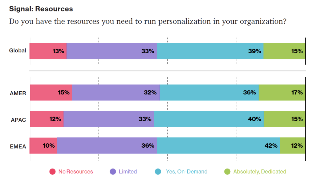
Personalization Pyramid: A Framework for Designing with User Data

As a UX professional in today’s data-driven landscape, it’s increasingly likely that you’ve been asked to design a personalized digital experience, whether it’s a public website, user portal, or native application. Yet while there continues to be no shortage of marketing hype around personalization platforms, we still have very few standardized approaches for implementing personalized UX.

That’s where we come in. After completing dozens of personalization projects over the past few years, we gave ourselves a goal: could you create a holistic personalization framework specifically for UX practitioners? The Personalization Pyramid is a designer-centric model for standing up human-centered personalization programs, spanning data, segmentation, content delivery, and overall goals. By using this approach, you will be able to understand the core components of a contemporary, UX-driven personalization program (or at the very least know enough to get started). 

Getting Started

For the sake of this article, we’ll assume you’re already familiar with the basics of digital personalization. A good overview can be found here: Website Personalization Planning. While UX projects in this area can take on many different forms, they often stem from similar starting points.      

Common scenarios for starting a personalization project:


Your organization or client purchased a content management system (CMS) or marketing automation platform (MAP) or related technology that supports personalization


The CMO, CDO, or CIO has identified personalization as a goal


Customer data is disjointed or ambiguous


You are running some isolated targeting campaigns or A/B testing


Stakeholders disagree on personalization approach


Mandate of customer privacy rules (e.g. GDPR) requires revisiting existing user targeting practices

Regardless of where you begin, a successful personalization program will require the same core building blocks. We’ve captured these as the “levels” on the pyramid. Whether you are a UX designer, researcher, or strategist, understanding the core components can help make your contribution successful.  

From top to bottom, the levels include:


North Star: What larger strategic objective is driving the personalization program? 


Goals: What are the specific, measurable outcomes of the program? 


Touchpoints: Where will the personalized experience be served?


Contexts and Campaigns: What personalization content will the user see?


User Segments: What constitutes a unique, usable audience? 


Actionable Data: What reliable and authoritative data is captured by our technical platform to drive personalization?  


Raw Data: What wider set of data is conceivably available (already in our setting) allowing you to personalize?

We’ll go through each of these levels in turn. To help make this actionable, we created an accompanying deck of cards to illustrate specific examples from each level. We’ve found them helpful in personalization brainstorming sessions, and will include examples for you here.

Starting at the Top

The components of the pyramid are as follows:

North Star

A north star is what you are aiming for overall with your personalization program (big or small). The North Star defines the (one) overall mission of the personalization program. What do you wish to accomplish? North Stars cast a shadow. The bigger the star, the bigger the shadow. Example of North Starts might include: 


Function: Personalize based on basic user inputs. Examples: “Raw” notifications, basic search results, system user settings and configuration options, general customization, basic optimizations


Feature: Self-contained personalization componentry. Examples: “Cooked” notifications, advanced optimizations (geolocation), basic dynamic messaging, customized modules, automations, recommenders


Experience: Personalized user experiences across multiple interactions and user flows. Examples: Email campaigns, landing pages, advanced messaging (i.e. C2C chat) or conversational interfaces, larger user flows and content-intensive optimizations (localization).


Product: Highly differentiating personalized product experiences. Examples: Standalone, branded experiences with personalization at their core, like the “algotorial” playlists by Spotify such as Discover Weekly.

North star cards. These can help orient your team towards a common goal that personalization will help achieve; Also, these are useful for characterizing the end-state ambition of the presently stated personalization effort.

Goals

As in any good UX design, personalization can help accelerate designing with customer intentions. Goals are the tactical and measurable metrics that will prove the overall program is successful. A good place to start is with your current analytics and measurement program and metrics you can benchmark against. In some cases, new goals may be appropriate. The key thing to remember is that personalization itself is not a goal, rather it is a means to an end. Common goals include:


Conversion


Time on task


Net promoter score (NPS)


Customer satisfaction 

Goal cards. Examples of some common KPIs related to personalization that are concrete and measurable.

Touchpoints

Touchpoints are where the personalization happens. As a UX designer, this will be one of your largest areas of responsibility. The touchpoints available to you will depend on how your personalization and associated technology capabilities are instrumented, and should be rooted in improving a user’s experience at a particular point in the journey. Touchpoints can be multi-device (mobile, in-store, website) but also more granular (web banner, web pop-up etc.). Here are some examples:

Channel-level Touchpoints


Email: Role


Email: Time of open


In-store display (JSON endpoint)


Native app


Search

Wireframe-level Touchpoints


Web overlay


Web alert bar


Web banner


Web content block


Web menu

Touchpoint cards. Examples of common personalization touchpoints: these can vary from narrow (e.g., email) to broad (e.g., in-store).

If you’re designing for web interfaces, for example, you will likely need to include personalized “zones” in your wireframes. The content for these can be presented programmatically in touchpoints based on our next step, contexts and campaigns.

Targeted Zones: Examples from Kibo of personalized “zones” on page-level wireframes occurring at various stages of a user journey (Engagement phase at left and Purchase phase at right.)

Source: “Essential Guide to End-to-End Personaliztion” by Kibo.

Contexts and Campaigns

Once you’ve outlined some touchpoints, you can consider the actual personalized content a user will receive. Many personalization tools will refer to these as “campaigns” (so, for example, a campaign on a web banner for new visitors to the website). These will programmatically be shown at certain touchpoints to certain user segments, as defined by user data. At this stage, we find it helpful to consider two separate models: a context model and a content model. The context helps you consider the level of engagement of the user at the personalization moment, for example a user casually browsing information vs. doing a deep-dive. Think of it in terms of information retrieval behaviors. The content model can then help you determine what type of personalization to serve based on the context (for example, an “Enrich” campaign that shows related articles may be a suitable supplement to extant content).

Personalization Context Model:


Browse


Skim


Nudge


Feast

Personalization Content Model:


Alert


Make Easier


Cross-Sell


Enrich

We’ve written extensively about each of these models elsewhere, so if you’d like to read more you can check out Colin’s Personalization Content Model and Jeff’s Personalization Context Model

Campaign and Context cards: This level of the pyramid can help your team focus around the types of personalization to deliver end users and the use-cases in which they will experience it.

User Segments

User segments can be created prescriptively or adaptively, based on user research (e.g. via rules and logic tied to set user behaviors or via A/B testing). At a minimum you will likely need to consider how to treat the unknown or first-time visitor, the guest or returning visitor for whom you may have a stateful cookie (or equivalent post-cookie identifier), or the authenticated visitor who is logged in. Here are some examples from the personalization pyramid:


Unknown


Guest


Authenticated


Default


Referred


Role


Cohort


Unique ID

Segment cards. Examples of common personalization segments: at a minimum, you will need to consider the anonymous, guest, and logged in user types. Segmentation can get dramatically more complex from there.

Actionable Data

Every organization with any digital presence has data. It’s a matter of asking what data you can ethically collect on users, its inherent reliability and value, as to how can you use it (sometimes known as “data activation.”) Fortunately, the tide is turning to first-party data: a recent study by Twilio estimates some 80% of businesses are using at least some type of first-party data to personalize the customer experience. 

First-party data represents multiple advantages on the UX front, including being relatively simple to collect, more likely to be accurate, and less susceptible to the “creep factor” of third-party data. So a key part of your UX strategy should be to determine what the best form of data collection is on your audiences. Here are some examples:


There is a progression of profiling when it comes to recognizing and making decisioning about different audiences and their signals. It tends to move towards more granular constructs about smaller and smaller cohorts of users as time and confidence and data volume grow.

While some combination of implicit / explicit data is generally a prerequisite for any implementation (more commonly referred to as first party and third-party data) ML efforts are typically not cost-effective directly out of the box. This is because a strong data backbone and content repository is a prerequisite for optimization. But these approaches should be considered as part of the larger roadmap and may indeed help accelerate the organization’s overall progress. Typically at this point you will partner with key stakeholders and product owners to design a profiling model. The profiling model includes defining approach to configuring profiles, profile keys, profile cards and pattern cards. A multi-faceted approach to profiling which makes it scalable.

Pulling it Together

While the cards comprise the starting point to an inventory of sorts (we provide blanks for you to tailor your own), a set of potential levers and motivations for the style of personalization activities you aspire to deliver, they are more valuable when thought of in a grouping. 

In assembling a card “hand”, one can begin to trace the entire trajectory from leadership focus down through a strategic and tactical execution. It is also at the heart of the way both co-authors have conducted workshops in assembling a program backlog—which is a fine subject for another article.

In the meantime, what is important to note is that each colored class of card is helpful to survey in understanding the range of choices potentially at your disposal, it is threading through and making concrete decisions about for whom this decisioning will be made: where, when, and how.

Lay Down Your Cards

Any sustainable personalization strategy must consider near, mid and long-term goals. Even with the leading CMS platforms like Sitecore and Adobe or the most exciting composable CMS DXP out there, there is simply no “easy button” wherein a personalization program can be stood up and immediately view meaningful results. That said, there is a common grammar to all personalization activities, just like every sentence has nouns and verbs. These cards attempt to map that territory.

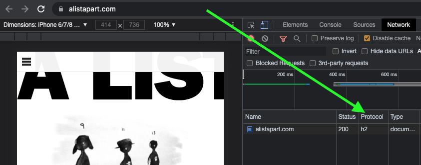
Mobile-First CSS: Is It Time for a Rethink?

The mobile-first design methodology is great—it focuses on what really matters to the user, it’s well-practiced, and it’s been a common design pattern for years. So developing your CSS mobile-first should also be great, too…right? 

Well, not necessarily. Classic mobile-first CSS development is based on the principle of overwriting style declarations: you begin your CSS with default style declarations, and overwrite and/or add new styles as you add breakpoints with min-width media queries for larger viewports (for a good overview see “What is Mobile First CSS and Why Does It Rock?”). But all those exceptions create complexity and inefficiency, which in turn can lead to an increased testing effort and a code base that’s harder to maintain. Admit it—how many of us willingly want that?

On your own projects, mobile-first CSS may yet be the best tool for the job, but first you need to evaluate just how appropriate it is in light of the visual design and user interactions you’re working on. To help you get started, here’s how I go about tackling the factors you need to watch for, and I’ll discuss some alternate solutions if mobile-first doesn’t seem to suit your project.

Advantages of mobile-first

Some of the things to like with mobile-first CSS development—and why it’s been the de facto development methodology for so long—make a lot of sense:

Development hierarchy. One thing you undoubtedly get from mobile-first is a nice development hierarchy—you just focus on the mobile view and get developing. 

Tried and tested. It’s a tried and tested methodology that’s worked for years for a reason: it solves a problem really well.

Prioritizes the mobile view. The mobile view is the simplest and arguably the most important, as it encompasses all the key user journeys, and often accounts for a higher proportion of user visits (depending on the project). 

Prevents desktop-centric development. As development is done using desktop computers, it can be tempting to initially focus on the desktop view. But thinking about mobile from the start prevents us from getting stuck later on; no one wants to spend their time retrofitting a desktop-centric site to work on mobile devices!

Disadvantages of mobile-first

Setting style declarations and then overwriting them at higher breakpoints can lead to undesirable ramifications:

More complexity. The farther up the breakpoint hierarchy you go, the more unnecessary code you inherit from lower breakpoints. 

Higher CSS specificity. Styles that have been reverted to their browser default value in a class name declaration now have a higher specificity. This can be a headache on large projects when you want to keep the CSS selectors as simple as possible.

Requires more regression testing. Changes to the CSS at a lower view (like adding a new style) requires all higher breakpoints to be regression tested.

The browser can’t prioritize CSS downloads. At wider breakpoints, classic mobile-first min-width media queries don’t leverage the browser’s capability to download CSS files in priority order.

The problem of property value overrides

There is nothing inherently wrong with overwriting values; CSS was designed to do just that. Still, inheriting incorrect values is unhelpful and can be burdensome and inefficient. It can also lead to increased style specificity when you have to overwrite styles to reset them back to their defaults, something that may cause issues later on, especially if you are using a combination of bespoke CSS and utility classes. We won’t be able to use a utility class for a style that has been reset with a higher specificity.

With this in mind, I’m developing CSS with a focus on the default values much more these days. Since there’s no specific order, and no chains of specific values to keep track of, this frees me to develop breakpoints simultaneously. I concentrate on finding common styles and isolating the specific exceptions in closed media query ranges (that is, any range with a max-width set). 

This approach opens up some opportunities, as you can look at each breakpoint as a clean slate. If a component’s layout looks like it should be based on Flexbox at all breakpoints, it’s fine and can be coded in the default style sheet. But if it looks like Grid would be much better for large screens and Flexbox for mobile, these can both be done entirely independently when the CSS is put into closed media query ranges. Also, developing simultaneously requires you to have a good understanding of any given component in all breakpoints up front. This can help surface issues in the design earlier in the development process. We don’t want to get stuck down a rabbit hole building a complex component for mobile, and then get the designs for desktop and find they are equally complex and incompatible with the HTML we created for the mobile view! 

Though this approach isn’t going to suit everyone, I encourage you to give it a try. There are plenty of tools out there to help with concurrent development, such as Responsively App, Blisk, and many others. 

Having said that, I don’t feel the order itself is particularly relevant. If you are comfortable with focusing on the mobile view, have a good understanding of the requirements for other breakpoints, and prefer to work on one device at a time, then by all means stick with the classic development order. The important thing is to identify common styles and exceptions so you can put them in the relevant stylesheet—a sort of manual tree-shaking process! Personally, I find this a little easier when working on a component across breakpoints, but that’s by no means a requirement.

Closed media query ranges in practice 

In classic mobile-first CSS we overwrite the styles, but we can avoid this by using media query ranges. To illustrate the difference (I’m using SCSS for brevity), let’s assume there are three visual designs: 


smaller than 768from 768 to below 10241024 and anything larger 

Take a simple example where a block-level element has a default padding of “20px,” which is overwritten at tablet to be “40px” and set back to “20px” on desktop.

Classic min-width mobile-first

.my-block {
padding: 20px;
@media (min-width: 768px) {
padding: 40px;
}
@media (min-width: 1024px) {
padding: 20px;
}
}

Closed media query range

.my-block {
padding: 20px;
@media (min-width: 768px) and (max-width: 1023.98px) {
padding: 40px;
}
}

The subtle difference is that the mobile-first example sets the default padding to “20px” and then overwrites it at each breakpoint, setting it three times in total. In contrast, the second example sets the default padding to “20px” and only overrides it at the relevant breakpoint where it isn’t the default value (in this instance, tablet is the exception).

The goal is to: 


Only set styles when needed. Not set them with the expectation of overwriting them later on, again and again. 

To this end, closed media query ranges are our best friend. If we need to make a change to any given view, we make it in the CSS media query range that applies to the specific breakpoint. We’ll be much less likely to introduce unwanted alterations, and our regression testing only needs to focus on the breakpoint we have actually edited. 

Taking the above example, if we find that .my-block spacing on desktop is already accounted for by the margin at that breakpoint, and since we want to remove the padding altogether, we could do this by setting the mobile padding in a closed media query range.

.my-block {
  @media (max-width: 767.98px) {
    padding: 20px;
  }
  @media (min-width: 768px) and (max-width: 1023.98px) {
    padding: 40px;
  }
}

The browser default padding for our block is “0,” so instead of adding a desktop media query and using unset or “0” for the padding value (which we would need with mobile-first), we can wrap the mobile padding in a closed media query (since it is now also an exception) so it won’t get picked up at wider breakpoints. At the desktop breakpoint, we won’t need to set any padding style, as we want the browser default value.

Bundling versus separating the CSS

Back in the day, keeping the number of requests to a minimum was very important due to the browser’s limit of concurrent requests (typically around six). As a consequence, the use of image sprites and CSS bundling was the norm, with all the CSS being downloaded in one go, as one stylesheet with highest priority. 

With HTTP/2 and HTTP/3 now on the scene, the number of requests is no longer the big deal it used to be. This allows us to separate the CSS into multiple files by media query. The clear benefit of this is the browser can now request the CSS it currently needs with a higher priority than the CSS it doesn’t. This is more performant and can reduce the overall time page rendering is blocked.

Which HTTP version are you using?

To determine which version of HTTP you’re using, go to your website and open your browser’s dev tools. Next, select the Network tab and make sure the Protocol column is visible. If “h2” is listed under Protocol, it means HTTP/2 is being used. 

Note: to view the Protocol in your browser’s dev tools, go to the Network tab, reload your page, right-click any column header (e.g., Name), and check the Protocol column.

Also, if your site is still using HTTP/1…WHY?!! What are you waiting for? There is excellent user support for HTTP/2.

Splitting the CSS

Separating the CSS into individual files is a worthwhile task. Linking the separate CSS files using the relevant media attribute allows the browser to identify which files are needed immediately (because they’re render-blocking) and which can be deferred. Based on this, it allocates each file an appropriate priority.

In the following example of a website visited on a mobile breakpoint, we can see the mobile and default CSS are loaded with “Highest” priority, as they are currently needed to render the page. The remaining CSS files (print, tablet, and desktop) are still downloaded in case they’ll be needed later, but with “Lowest” priority. 

With bundled CSS, the browser will have to download the CSS file and parse it before rendering can start.

While, as noted, with the CSS separated into different files linked and marked up with the relevant media attribute, the browser can prioritize the files it currently needs. Using closed media query ranges allows the browser to do this at all widths, as opposed to classic mobile-first min-width queries, where the desktop browser would have to download all the CSS with Highest priority. We can’t assume that desktop users always have a fast connection. For instance, in many rural areas, internet connection speeds are still slow. 

The media queries and number of separate CSS files will vary from project to project based on project requirements, but might look similar to the example below.

Bundled CSS

<link href=”site.css” rel=”stylesheet”>

This single file contains all the CSS, including all media queries, and it will be downloaded with Highest priority.

Separated CSS

<link href=”default.css” rel=”stylesheet”><link href=”mobile.css” media=”screen and (max-width: 767.98px)” rel=”stylesheet”><link href=”tablet.css” media=”screen and (min-width: 768px) and (max-width: 1083.98px)” rel=”stylesheet”><link href=”desktop.css” media=”screen and (min-width: 1084px)” rel=”stylesheet”><link href=”print.css” media=”print” rel=”stylesheet”>

Separating the CSS and specifying a media attribute value on each link tag allows the browser to prioritize what it currently needs. Out of the five files listed above, two will be downloaded with Highest priority: the default file, and the file that matches the current media query. The others will be downloaded with Lowest priority.

Depending on the project’s deployment strategy, a change to one file (mobile.css, for example) would only require the QA team to regression test on devices in that specific media query range. Compare that to the prospect of deploying the single bundled site.css file, an approach that would normally trigger a full regression test.

Moving on

The uptake of mobile-first CSS was a really important milestone in web development; it has helped front-end developers focus on mobile web applications, rather than developing sites on desktop and then attempting to retrofit them to work on other devices.

I don’t think anyone wants to return to that development model again, but it’s important we don’t lose sight of the issue it highlighted: that things can easily get convoluted and less efficient if we prioritize one particular device—any device—over others. For this reason, focusing on the CSS in its own right, always mindful of what is the default setting and what’s an exception, seems like the natural next step. I’ve started noticing small simplifications in my own CSS, as well as other developers’, and that testing and maintenance work is also a bit more simplified and productive. 

In general, simplifying CSS rule creation whenever we can is ultimately a cleaner approach than going around in circles of overrides. But whichever methodology you choose, it needs to suit the project. Mobile-first may—or may not—turn out to be the best choice for what’s involved, but first you need to solidly understand the trade-offs you’re stepping into.